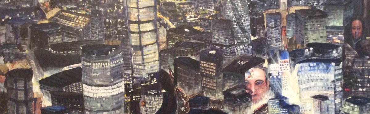
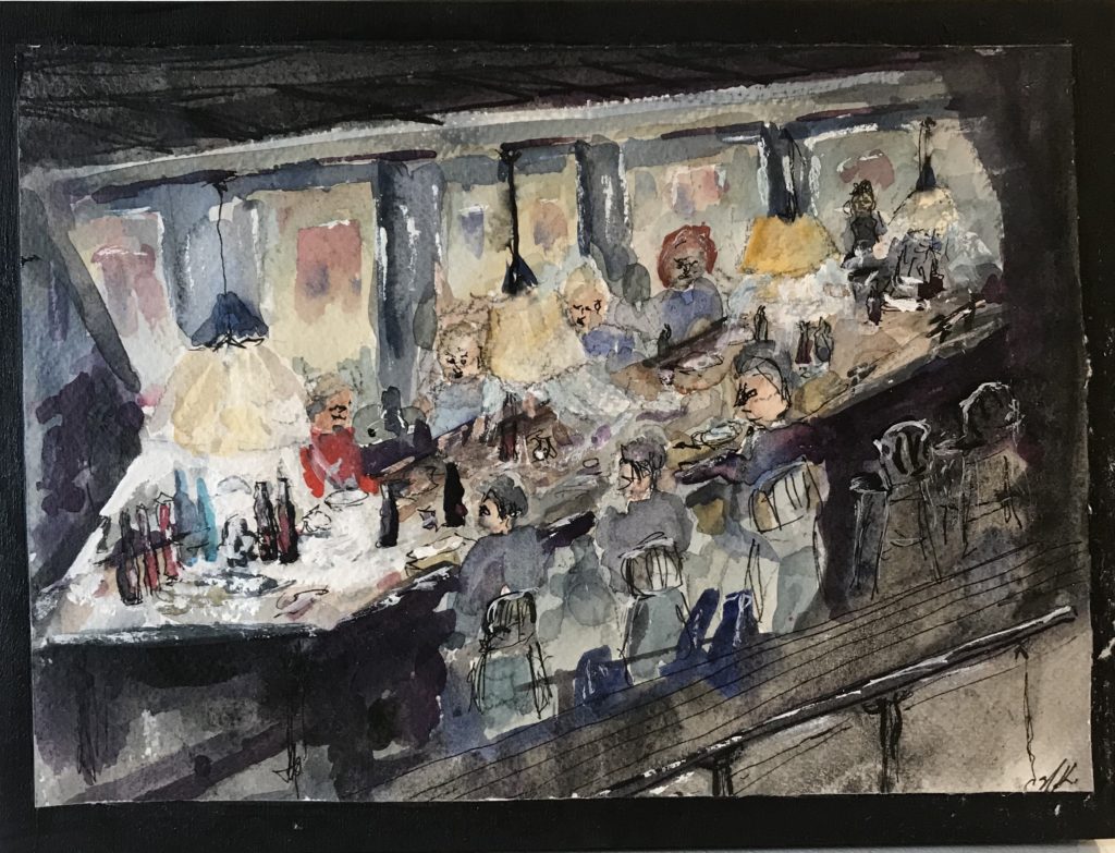
People. Lots of people. Moving, one direction, many directions, touching, in each other’s way, with a life of their own collectively. That’s a crowd. This one is light—more happy, joyful, liking each other.
The Crowd. Watercolour and ink on Yupo, 2021, 12 x 29 1/2.
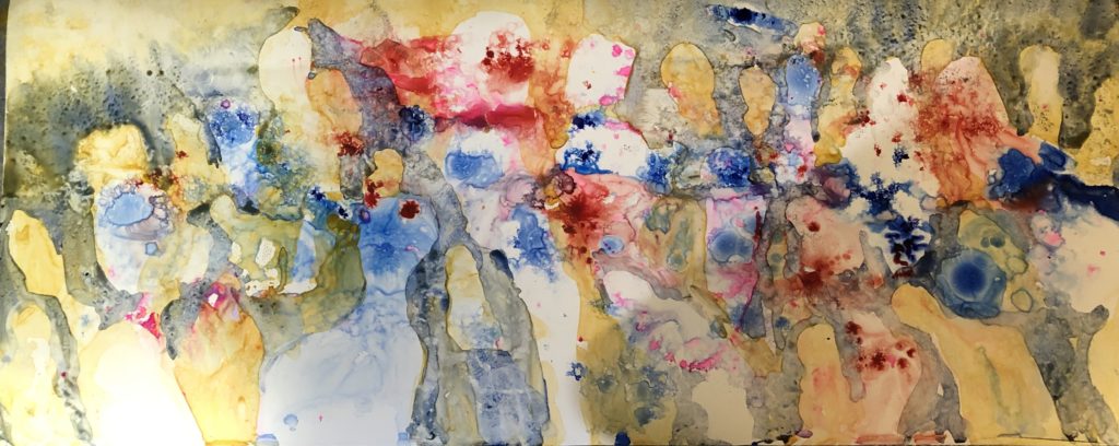
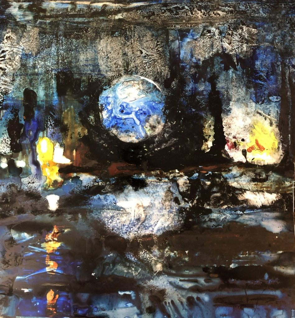
I have long been fascinated by the dark and nighttime. There are so many shades and colours that are part of the night. And the dark and light are both nourishing.
I started in acrylic. Recently I’ve used Yupo—a plastic paper substitute—because of the unpredictable flow of the paint on the surface.
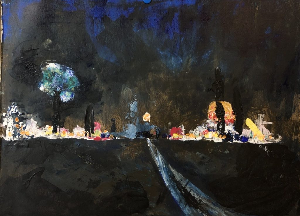
Road to the City (12 x 16) 2020. Acrylic on canvas.
Road to the Light (15 1/2 x 15 1/2) 2021. Watercolour, ink and acrylic on Yupo
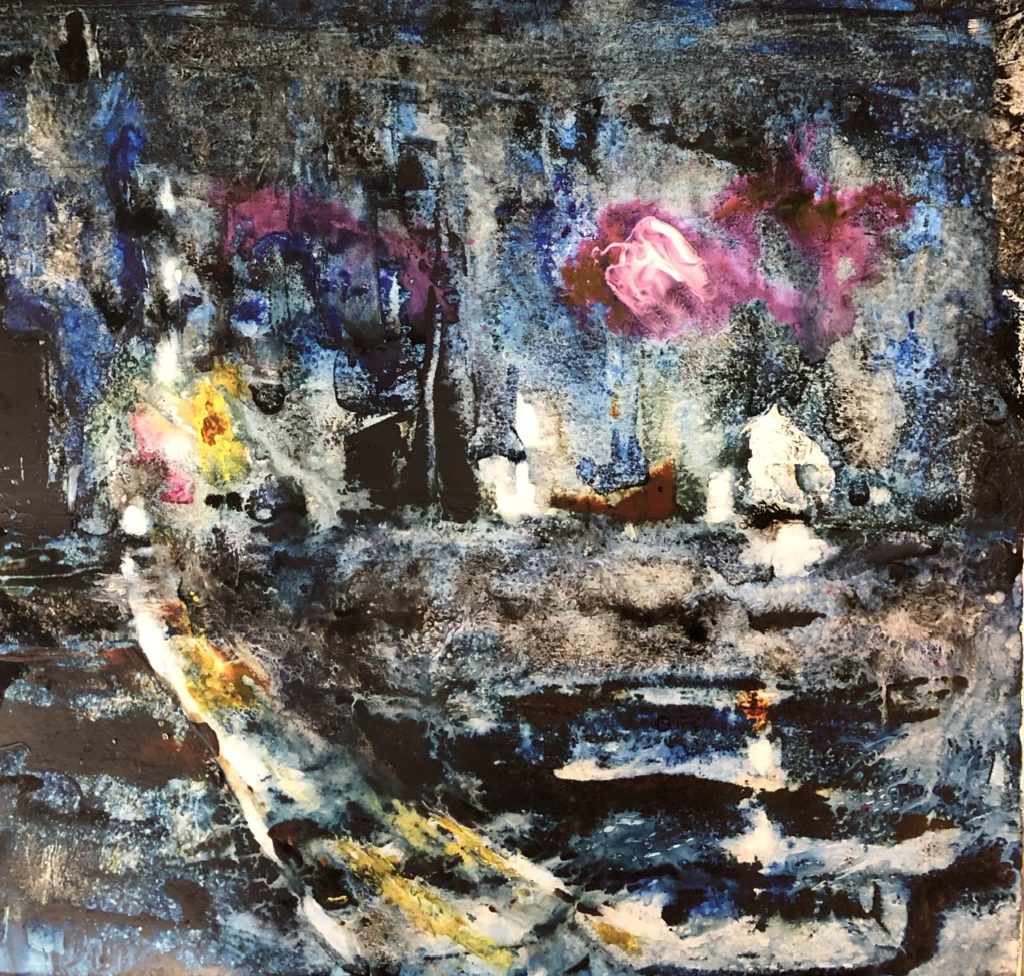
Rising. (15 1/2 x 14) 2021. Watercolour, ink and acrylic on Yupo
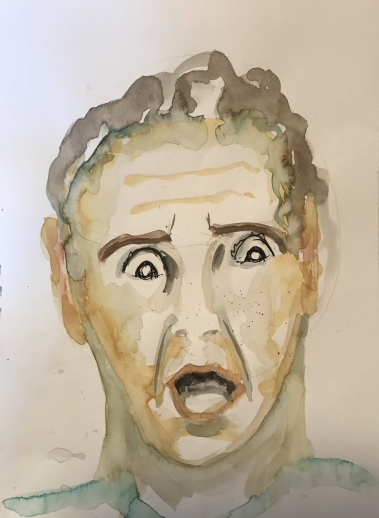
I want to get more recognizable images in the challenge that someone gave me to “paint emotion”. How do peoples’ facial features change with different emotions? Recognize that can be culture dependent. There are lots of examples to look at and build upon.
Fear!!!
Or surprise.
Or Worry.
Determination
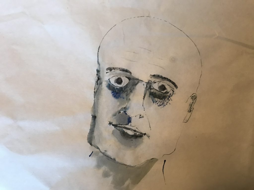
Sometimes a fast simple sketch is revealing.
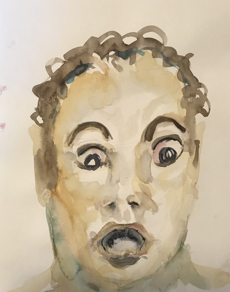
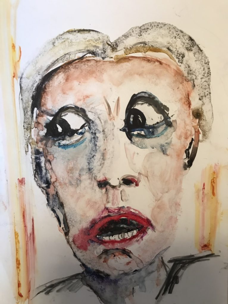
And then I played—this is on plastic yupo paper substitute and more a caricature and expressive.
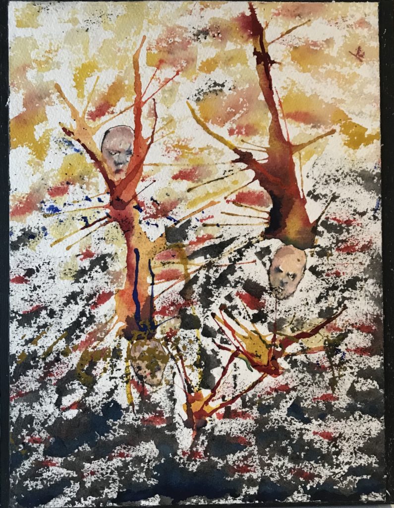
I started this as an exercise in moving paint around with a straw. That’s where the blobs came from. Then they reminded me of brain pictures. So I thought of connecting them to faces. I’m fascinated by connection, or disconnection.
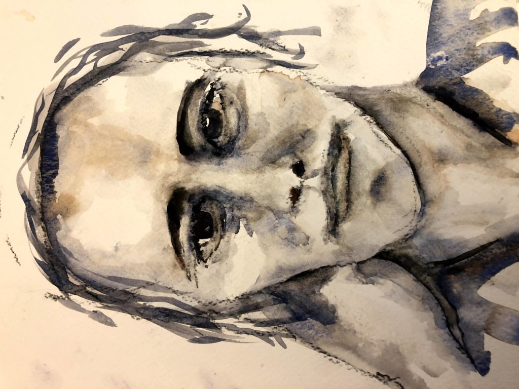
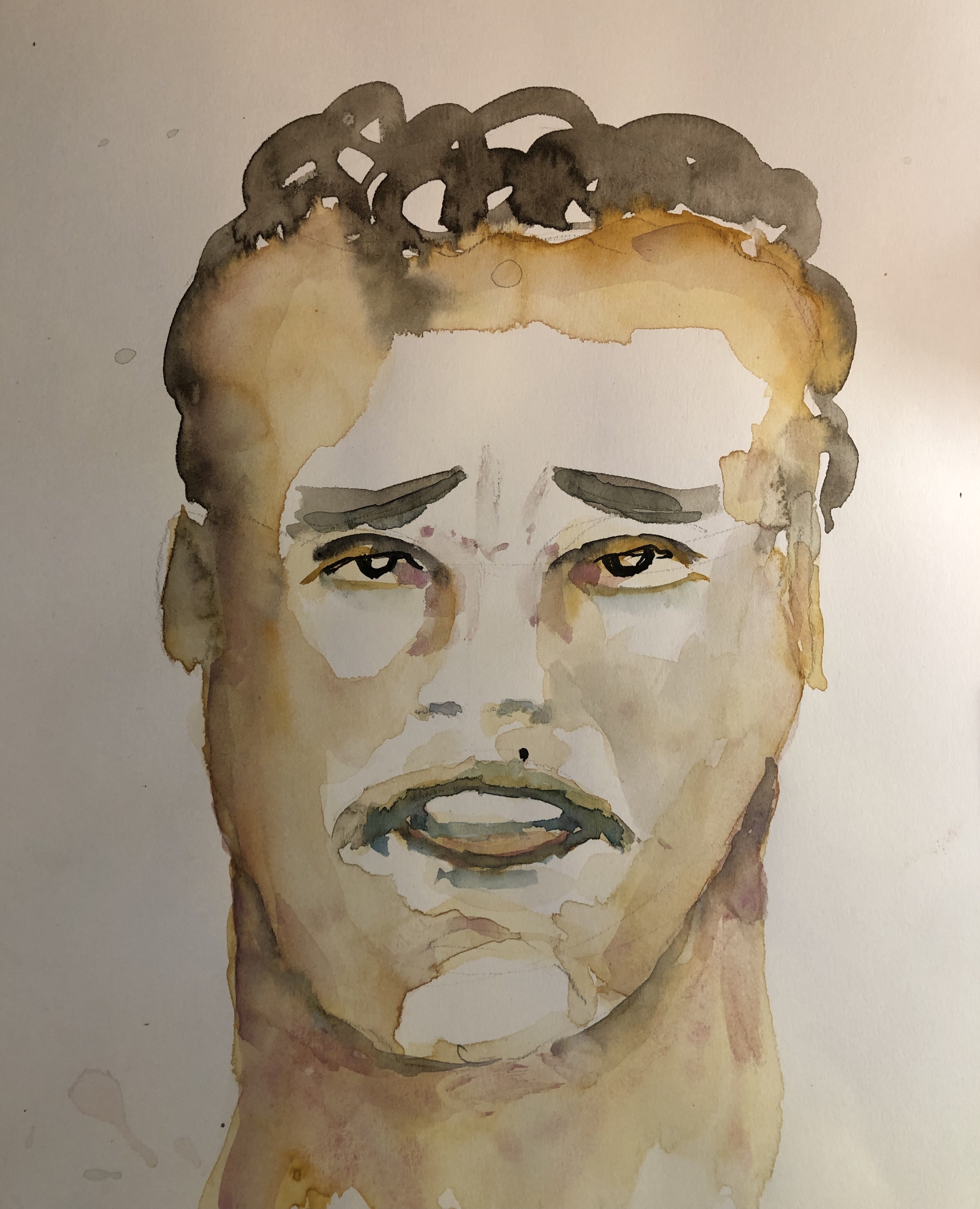
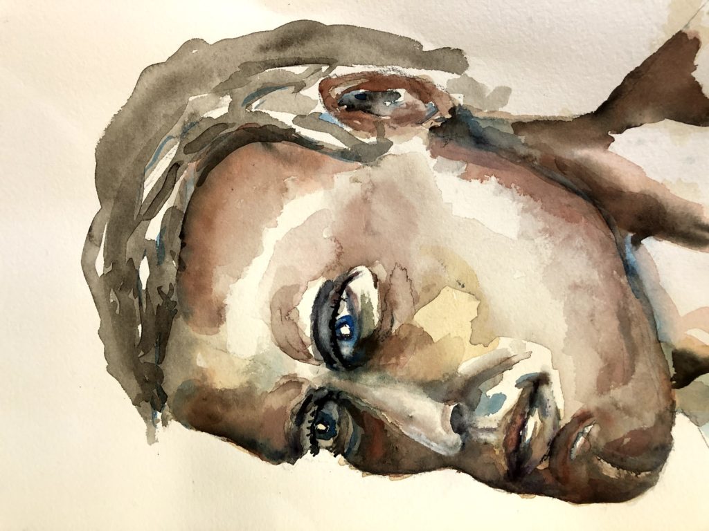
Feedback anyone? I am trying to do a three quarter view which is harder than straight on. He has a degree of intensity I like. This is mostly burnt sienna and ultramarine blue with a few dabs of other colours only.
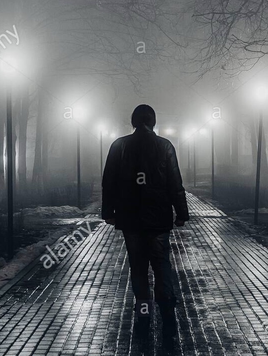
I had been searching internet images re emotions and the one below came up. I liked the feelings it evoked for me—loneliness, determination—and I am partial to trying to capture night scenes.
So I tried a watercolour and this is what I came up with.
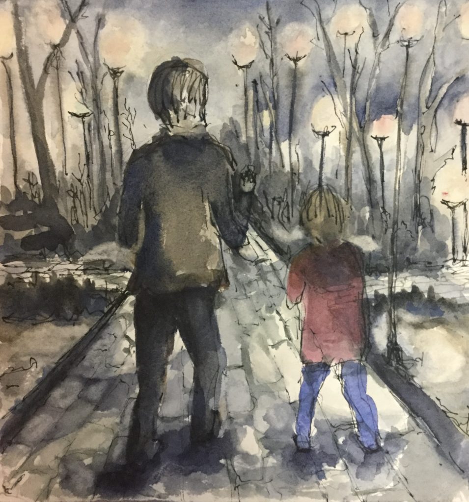
I liked the dark/ light contrast, but I didn’t like the composition. The proportions of the main figure weren’t right to my eye. Initially there wasn’t a second figure, but you can see that I added him/her as an afterthought. And the painting is very busy. There isn’t much emotion to my eye. The two figures aren’t touching. The original image has the figure with his/her head down but I haven’t really captured that. Nor the sense of aloneness. But I liked the combination of watercolour and pen and ink.
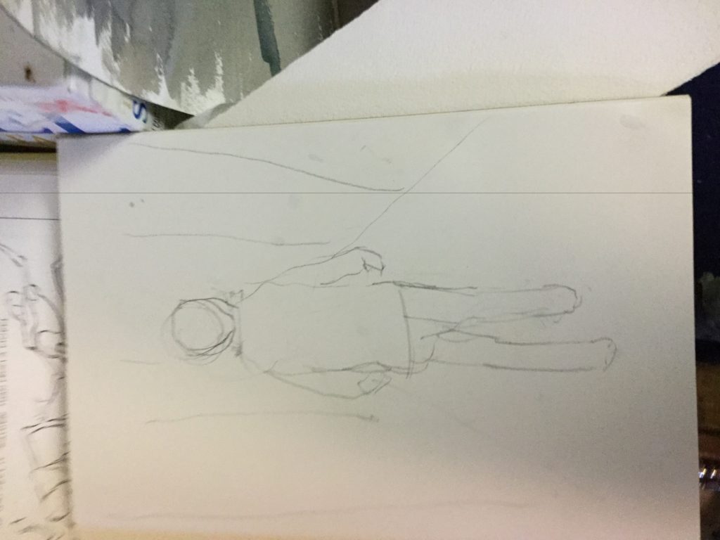
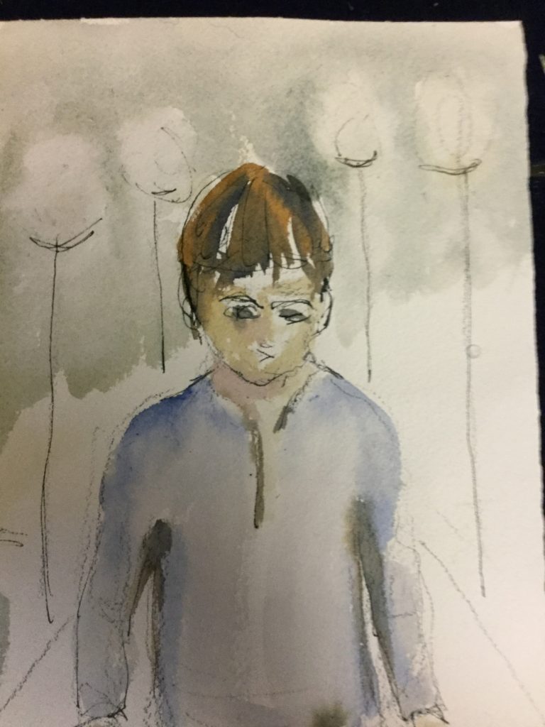
So I thought of having another try. It started with a new simple pencil sketch.
I struggled to get the head down (you can see the different marks) but I couldn’t get the figure to have the shape I wanted to express the feelings. My drawing skills could be improved. Note to self—google drawing figures moving away with head down. Then it came to me to turn the figure around!
Now that’s something to work with.!!!!!
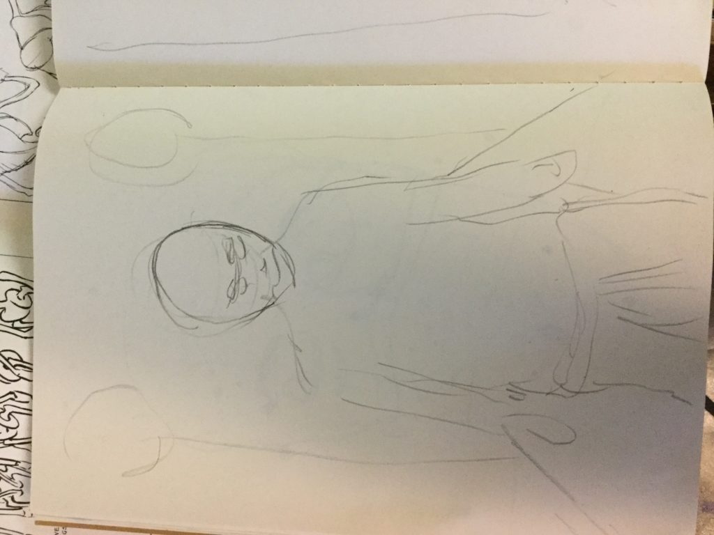
The composition is simpler too—not because I tried but because this sketch took no more than 1-2 minutes. By starting with the head the size it is, there was no more room on the sketch page for anything else. And I just put in the suggestion of a few of the lights, not a bunch of them. I was excited.
I’m trying to more and more trust my judgement when I try things. Watercolour is so forgiving. I don’t need to paint much to see if something has the possibility of working, or is fatally flawed. And if the latter I can always turn the paper over.
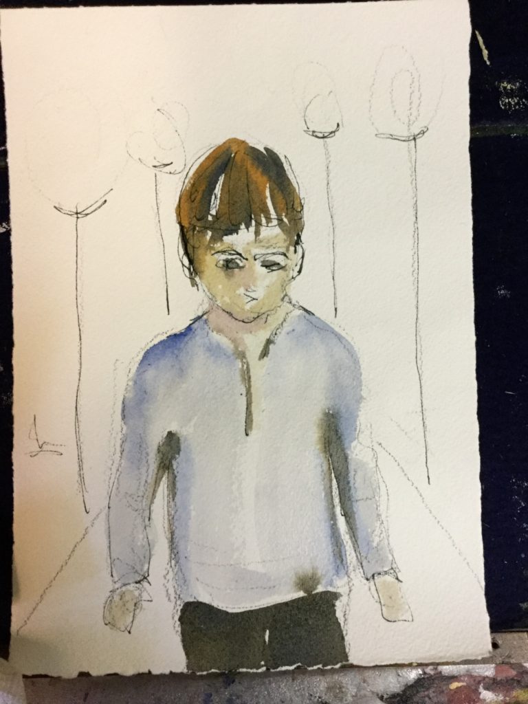
So here’s the first wash. I decided to add pen and ink from the beginning. My art teacher says don‘t wait till the end to add the hair.
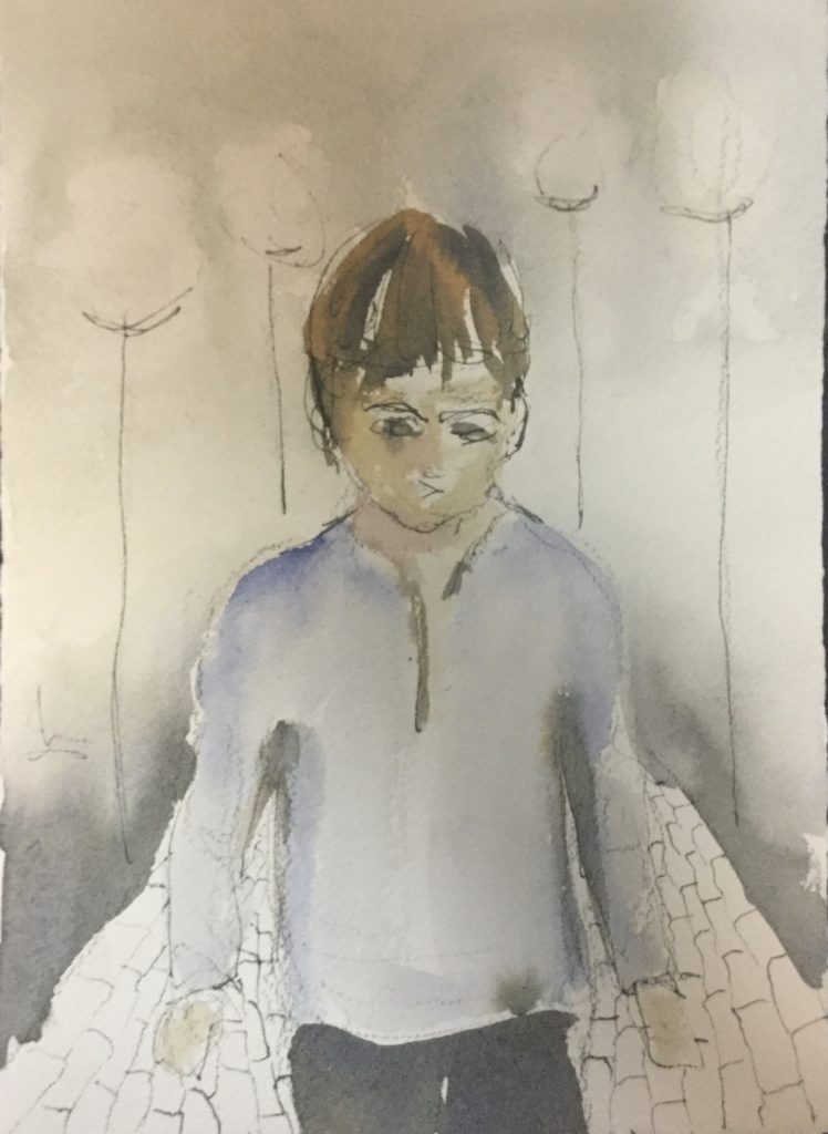
And here’s the second, third and fourth washes. I’m struggling to figure out the light, because there is a lot of light as well as the dark. So I am going slowly in adding washes. With my paper it doesn’t take long to dry. And each time I try to eliminate any hard edges in the light/shade sections. Otherwise I will have to come back and soften them later which is harder. Softening edges I did with paper towel and a brush with extra water. I’m not looking much at the original image. I’m trying to get into the feel of the one I am creating.
I wanted to preserve the strong perspective lines of the path. The pen and ink helped me there. Not very original but…..
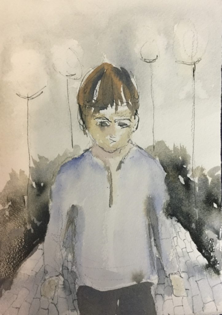
The face and head are impressionistic but some of the key techniques remain the same As a bigger portrait, even though this is smaller—shadows in the eye sockets, under the chin, and the position of the eyes and eyebrows to signal looking down. I Hold off adding a lot of detail—despite wanting to—as I know I tend to overwork.
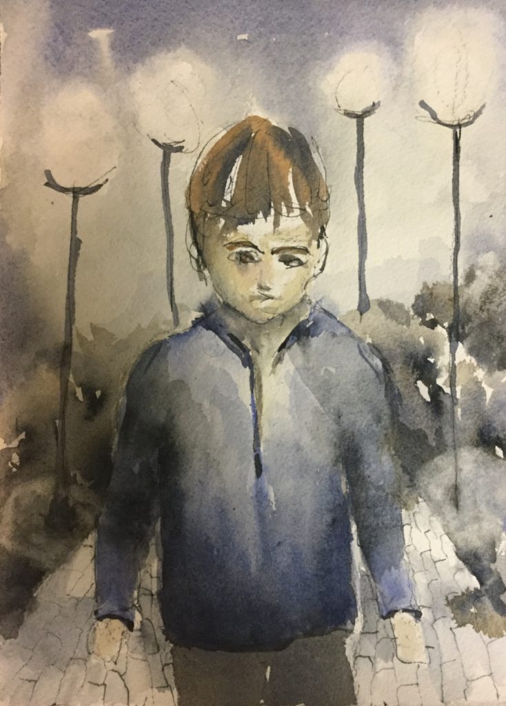
And now we get to close to final. Some additional contrast, some additional tone and colour in the lights. Adding darks to emphasize the sides of the path. Some shading on the path to suggest light cast by the lights. I’d like to be able to do that better.
Done (for now). I can think of several additions and improvements. Overall, far from perfect but a lot better than what I started with.